Investment Flow Chart Analysis - 1-2-2026
Once again, I am updating the Investment Flow Chart Analysis as of Friday, 1-2-2026
The methods described below borrow heavily upon the lessons learned from Ernie Zahn, Ralph Hansmann and William T. Golden at Cornell, Linder & Co. & Ben Graham during my time on Wall Street in the 1960’s utilizing fundamental research including Point & Figure charting.
Since then, I have incorporated ideas from William O’Neil’s CANSLIM methodology, Ian Woodard and High Growth Stocks as well as Stock Charts.
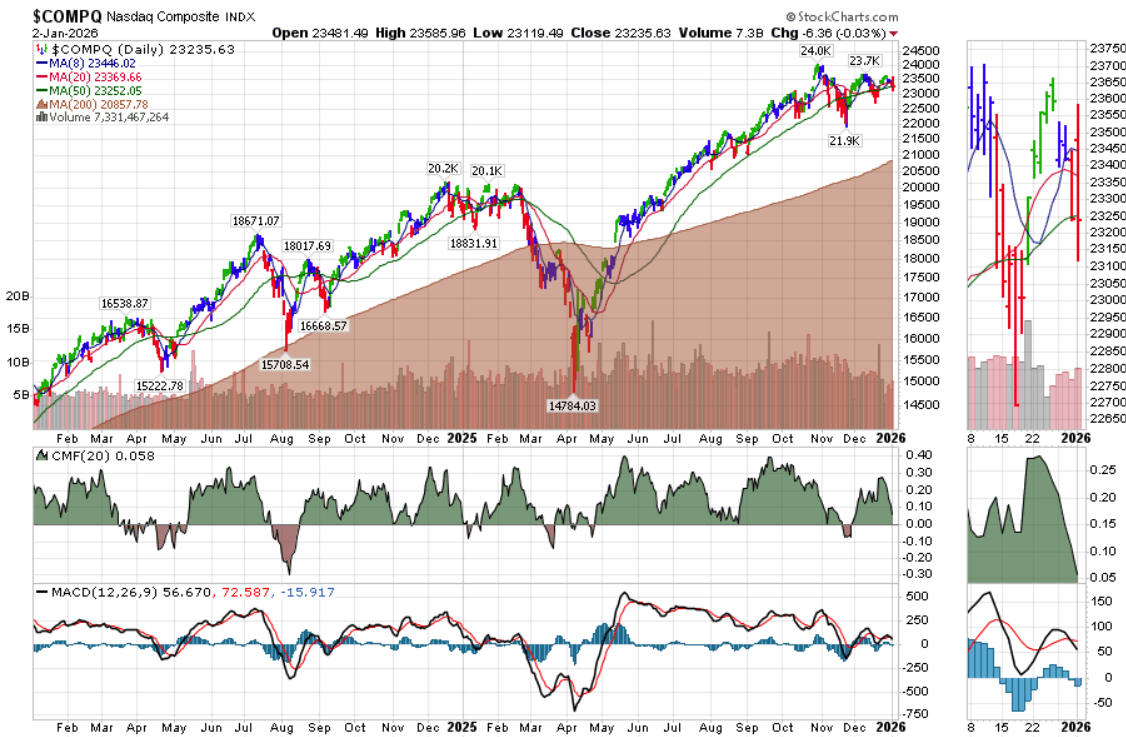
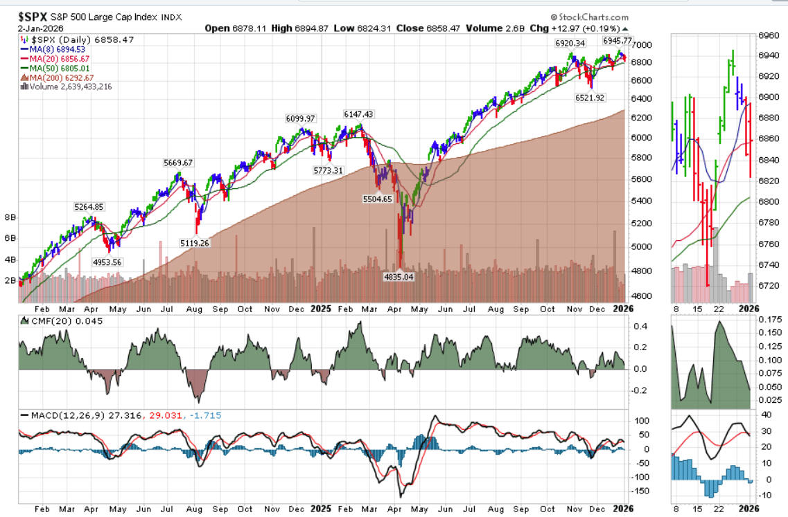
The first decision is to determine what the daily, short-term or long-term trend of the investment market is. To make this determination, look at the 50- and 200-day simple moving averages on a weekly chart as shown below to determine if both the NASDAQ and the S&P 500 averages are either both positive, both negative and/or split.
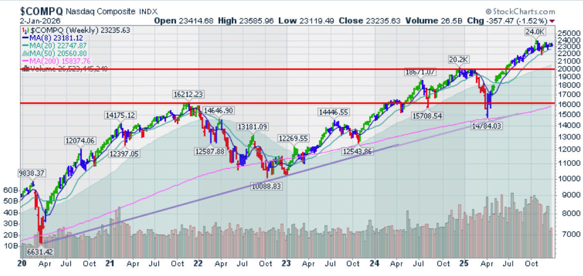
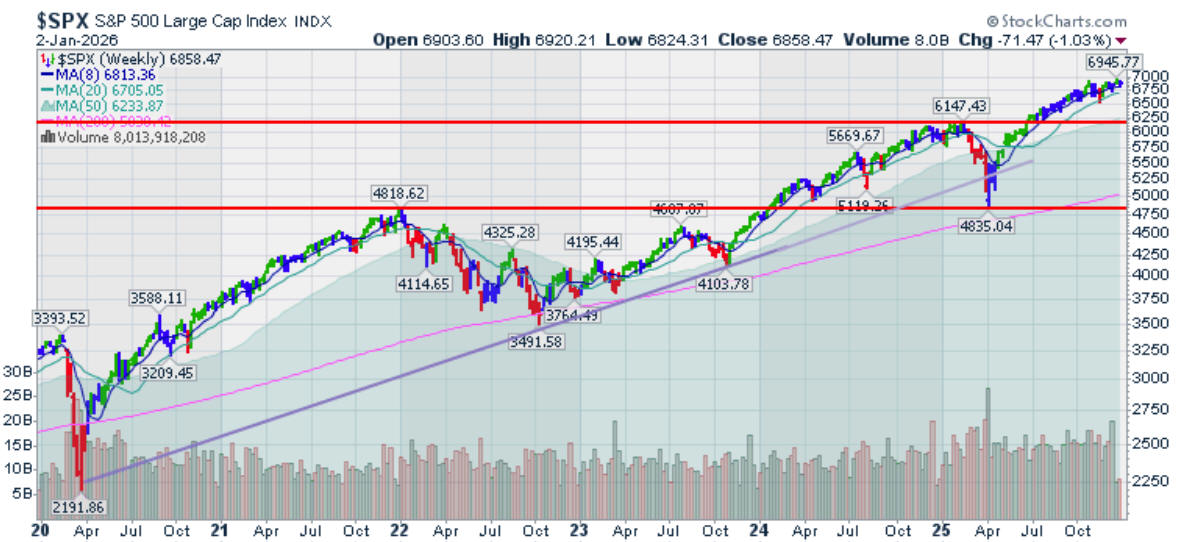
As can be seen in the above weekly charts of the NASDAQ and the S&P 500, the two indices remain above the 8- and 20-week simple moving average lines. Caution is advised as the underlying economic data is weakening.
So now the question is whether to:
1. Be long,
2. Be short, or
3. Be on the sidelines.
Remember pigs get slaughtered.
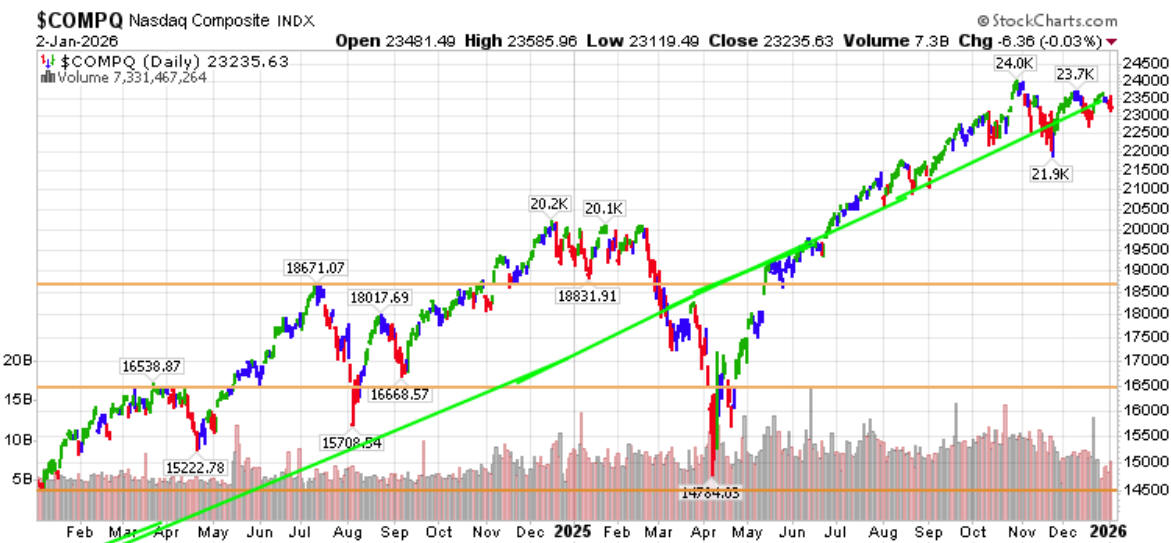
The Elder daily impulse charts show recent daily action in both the NASDAQ and the S&P 500.
 \
\
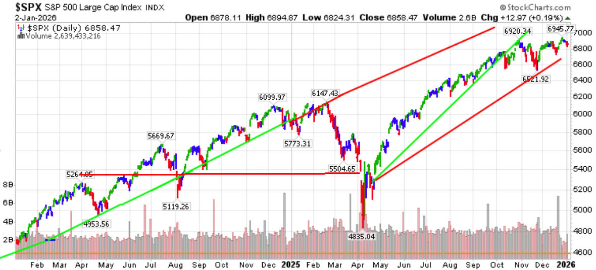
Although the longer-term trend shown in the first set of charts is positive, the Elder Impulse charts portray a market showing signs of downward pressure as the averages fell from recent near all-time record levels.
The Chalkin Money Flow indicator as seen in the following charts shows that cash has been withdrawn from the market since September although money was added in December.
The IBD market call has been changed to a commitment of 60- 80%.
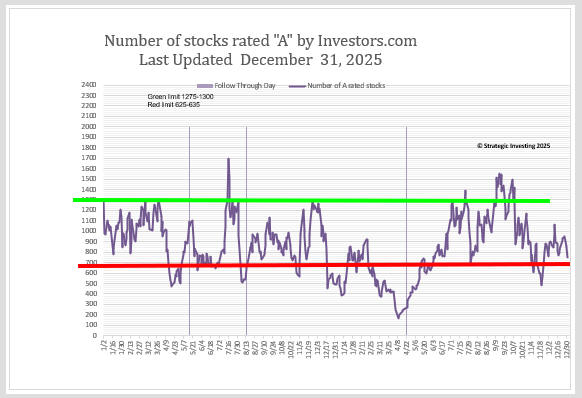
The Accumulation/Distribution chart is shown below. As clearly shown, the number of “A” rated stocks according to IBD has bounced back from below the red zone after the market action of the past week.
The methodology which I use has a rule that states that when the line falls below the green zone, profits need to be taken. Further, when the line falls below the red line, the trading portfolio should be in cash. As the line approaches the red line, trading positions with tight stops should be considered.
Investors should be concerned if the number of A's are unable to remain above the red zone as it is often the sign before a major correction begins.
On January 2, the Strategic Investing Portfolio is 100% invested with very tight stops as we play the infusion of cash from institutions making pension funding requirements.
We continue to run the various IBD and StockCharts screens each day but the current political and economic conditions suggest that prudence is still justified.
Nothing is new …. Just a new group of sheep to be shorn.
Fred Richards
2 January 2026 p.m.